NEXT
Shaping the future of education
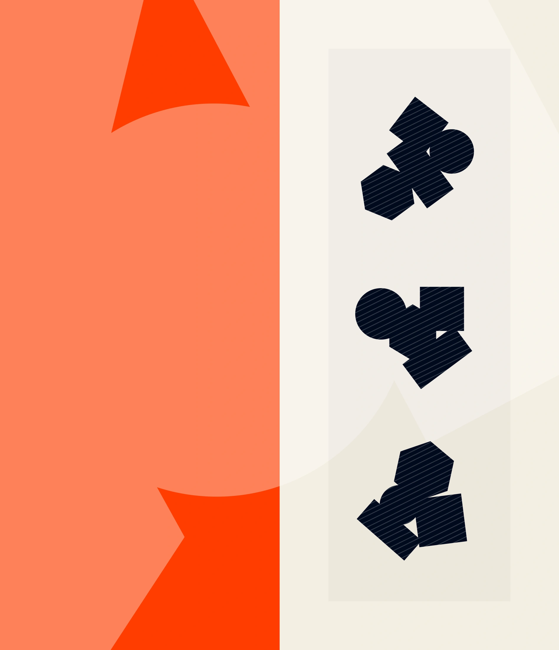
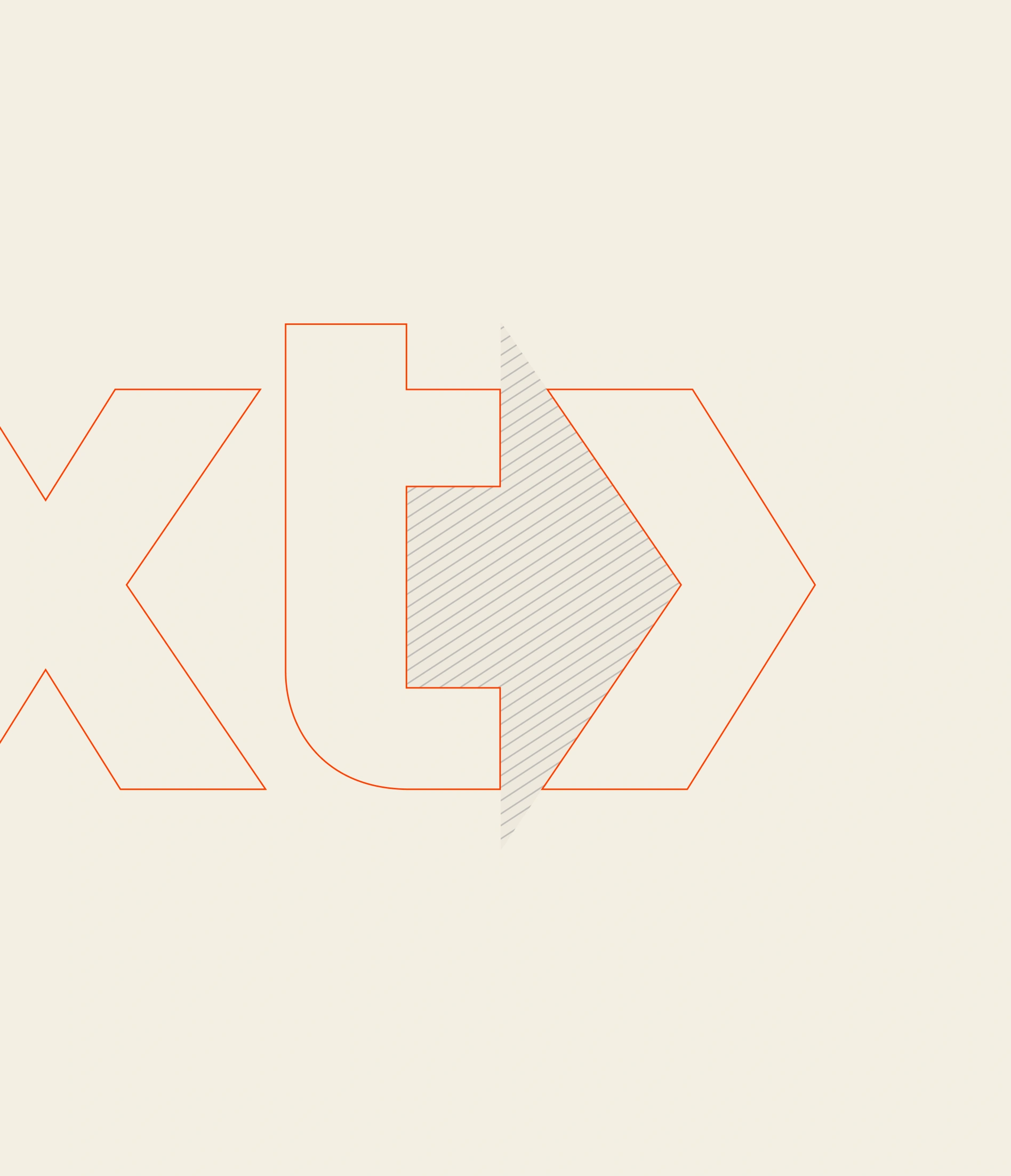
Next Education’s visual identity was designed to reflect the core principles of learning, centring around simple geometric shapes that symbolise the building blocks of knowledge. The design approach was rooted in the idea of creating a clean, modern identity that balances both energy and structure, much like the educational experience itself. A fresh and vibrant colour palette adds a sense of dynamism, while the subtle arrow within the logo’s negative space reinforces the institution’s progressive approach to education. Each visual element serves to highlight Next Education’s role as a place where curiosity is encouraged and where students are empowered to shape their future.
Deliverables
Brand design
Corporate design
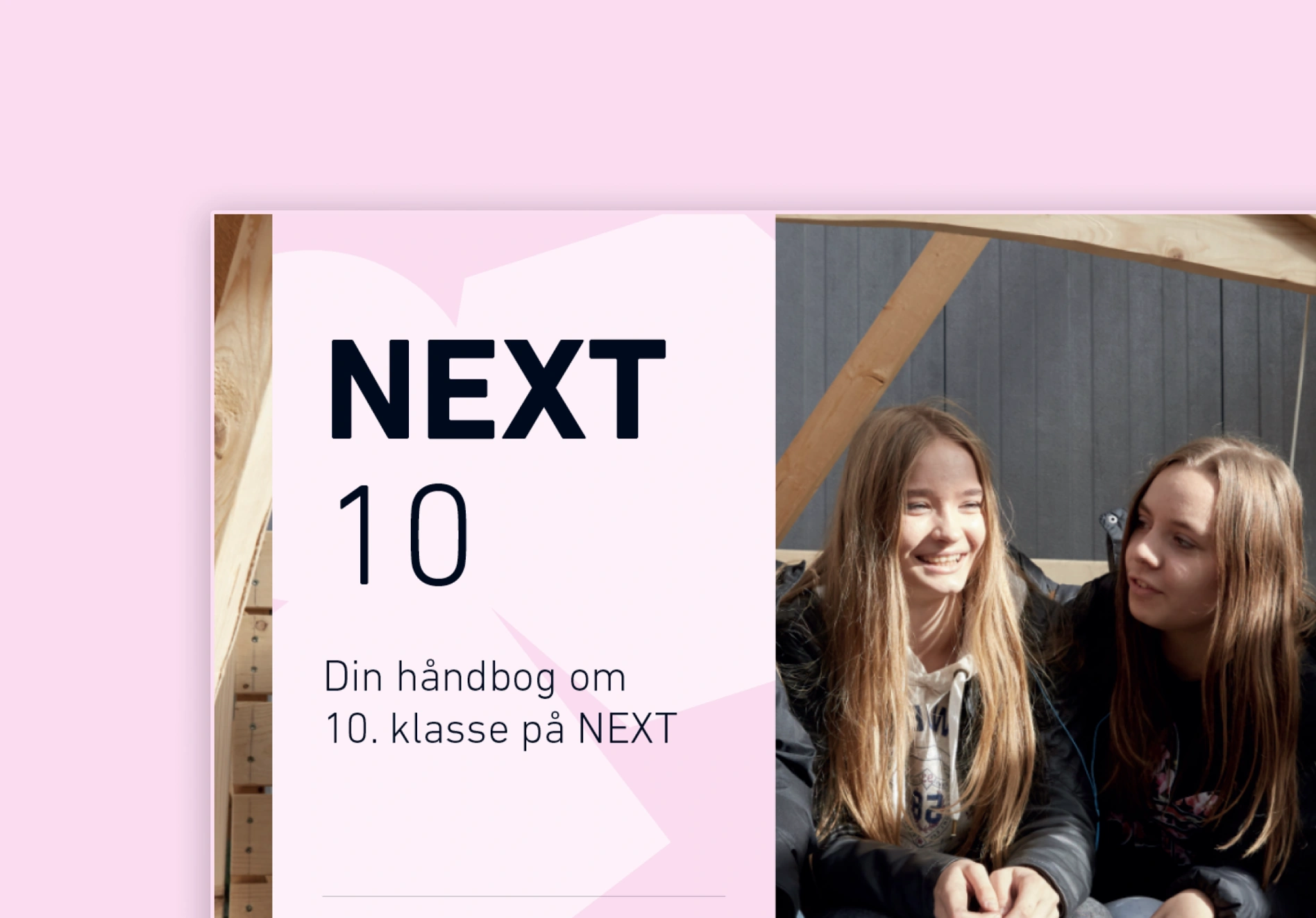
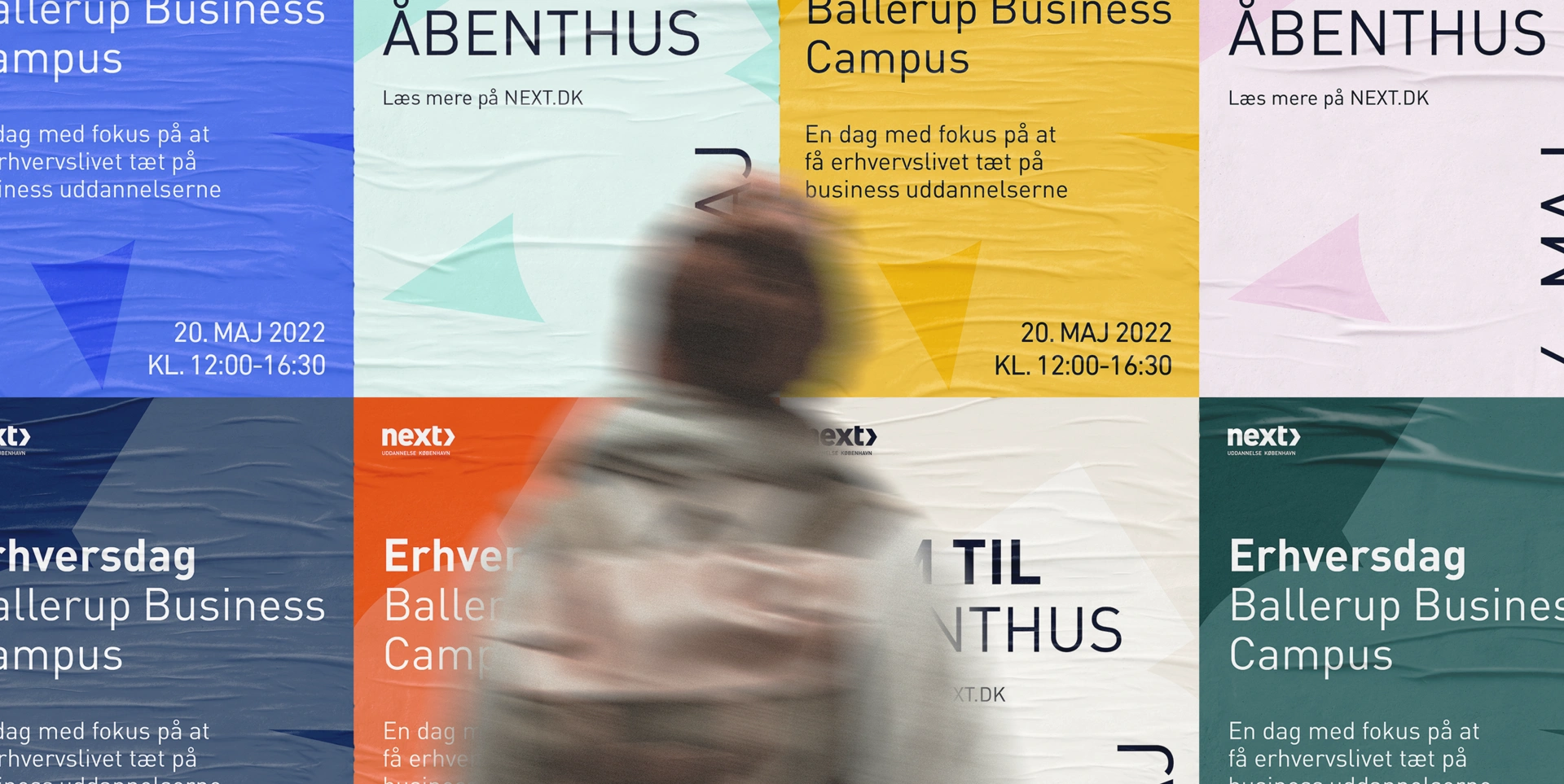
These geometric shapes are not static; they come together to form dynamic constellations that represent exploration, growth, and the continuous journey of learning. The flexibility of this design allows the identity to adapt and evolve, mirroring the fluid nature of education while maintaining a cohesive, recognisable brand presence.

